MOOC schmook

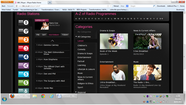
The discussion about MOOCs is raging again and various alarmist mutterings are occurring. I’ve even heard the phrase “paradigm shift” cropping up a few times. I’ve used the argument a few times that I think the panic that they’re creating is occurring unnecessarily because people are seeing MOOCs as the equivalent of courses, when really they’re not, they’re the equivalent of text books. There’s the worry that this could mean a transformation of HE in that people could just attend a MOOC, then go along to be assessed and get a qualification without ever attending an actual lecture in an actual university.

I’ve got some news for you. People have been doing that for centuries.

Well not attend a MOOC and get a qualification, but attending an exam without attending a taught course. I sat plenty of exams as an undergraduate where I hadn’t learnt anything from the lectures, but had to make sense of it independently from a text book. I’ve had lectures that actually were simply regurgitating text books (though in fairness those were usually written by the lecturer). There was no tailoring to the student base, no extra explanatory stuff if you were struggling, there was no sense of gaining insights from having a person standing there talking. There was no teaching.

The only advantage of attending the course delivered by the university rather than staying at home reading the text books was that they knew exactly what was to be on the exam, so you had to be there to find out what the syllabus was. Or in the case of my housemate at uni, have someone to send out to the lectures (i.e. me) so you could copy their notes when they got home (or by the second year she had the brainwave of buying lots of carbon paper “for me”, so she didn’t even need to do that).

So really, paying the fees to attend those lectures to the university, would have been a waste of money, since we could have just been given a syllabus and a reading list. This was when education was free though. The people who deserved the money for me passing those exams were the authors (Thank you Richard Feynman) and in the case of my computing assignments, the second and third years who offered me advice. Really I was only paying (or rather the state was only paying) for the university to accredit me, not to teach me. For those courses. Other ones were taught properly, I should add.

So where’s the harm in acknowledging that’s how HE has always worked and allow more people access to the role of providing content, and to be reimbursed for it? Just as kindle allows more people the opportunity to write and sell books directly. Education is a mixture of content, teaching, assessment and accreditation. The last two probably have to be provided by the same institution but the rest could be distributed. If you need to know something about, for example, quantum mechanics, join a MOOC (or watch some youtube videos, or read a book) about it. Need some help?, sign up with someone with a good reputation at teaching it, and if they’re good at it, they’ll put together a learning set on the subject. Feel you know enough?, sign up for an exam and be assessed. Accrue enough assessments, get a degree.

In reality, things probably won’t change that much. To be accredited you have to learn the right stuff to pass that particular exam. And universities will probably keep that close to their chest so you have to sign up with their course. Practical exams need equipment that only universities can afford to provide. Also the business model for MOOCs doesn’t really support them as standalone things. The only economic rationale for them that i can see is as a loss leader. If you like the MOOC but want to know more, then sign up for some tuition, and then sign up for the degree, or (perhaps if education does become more disaggregated) to be assessed and accredited at the end. Certainly there’s no way to make money directly from MOOCs since they’re not only free, but also the content is immediately rippable once it’s made public. Two colleagues I spoked to last week were expressing shock at a MOOC’s content being replicated within a week or two in its entirety and used to create another two MOOCs elsewhere. That seems to me to be perfectly appropriate. The learning isn’t happening when the content is being read, it’s happening elsewhere, in the communication between learners, or between learners and tutors. The content should be free because, essentially, it is the part of the process that has the least value.

Oh and as for the idea that it’s a cheap, and therefore affordable and accessible format for all those who don’t have access to HE, Martin Smith at Strathclyde points out that for the learners that don’t have access to HE normally, self-learning is not going to be that easy. There are a set of skills that you acquire by being formally taught, that you need in order to get the most from materials. This is where Sugatra Mitra’s idea of Self Organised Learning falls down. Yes you can go so far with self-organised learning, and some remarkable people are effectively self-taught, but it’s a difficult skill to learn for most, and no amount of other learners, or Intelligent Tutors/Agents/Bots are going to fill that gap.

Advertisement

A second blog

I’ve set a second blog up to capture all the stuff I wanted to say about things other than work; prompted mainly by all the street art I saw in Brazil. I don’t want to clog up the work-related posts with other things, so thought a secondary blog would be the best route. There will also be other things posted on neither the subject of non-formal art (about which I actually know nothing, I’m just interested) or elearning but they’ll probably be randomly distributed across the two. It’s at markchilds2.wordpress.com

Good and bad interface design

There’s a growing tendency in user interfaces to move to a “design aesthetic” rather than actually having something that actually works for the user. You know the sort of thing I mean. Metro, for example, which has made a pig’s ear of using my Xbox 360, and by most accounts has done the same thing for Windows. More and more functions are added, with the useful stuff buried deeper and deeper and more and more difficult to find. Instead of functionality the interface is replaced with stuff that “looks good”, as if that’s more important than being able to use it. I know why it happens. I went to journalism school for two years, and in that time we were taught a lot of the normative practices of journalism, a few old saws that got passed down from generation to generation. One of these was “people first, events second, ideas third”. This particular pearl of wisdom is why, whenever you see an article about some amazing scientific discovery, the article focuses on the life of the scientist making it. The reasoning is that people won’t be drawn in if you talk about the discovery, only if you talk about the person. This reasoning is why Horizon is far worse than it used to be, because you have a whole swathe of bollocks to sit through before you actually learn anything. There’s also a tendency to make vague generalisations about the subject matter first. I have a rule, that if a documentary hasn’t told me anything new by 7 minutes in, I turn it off. Pretty consistently this seems to work. Seven minutes of waffle, then bam some interesting fact. It’s as if they believe that if they shock us with information too early on it will damage our systems or something.

The thing is, there is no evidence for this as a rule. In fact, if you ask anyone in the audience they would put the relative importance of people, events, ideas in the reverse order. It is just that someone once made this up, and in a profession where people are desperate for a clue about how to do it well, people cling to it as a fact. It’s also why we have  the concept of “learning styles” in education and “digital natives” in elearning.

Designers seem to work from a similar set of principles that have just been pulled out of  <edit> thin air. </edit>. Resistance to the introduction of the newer interface, which is “cleaner” or “more aesthetic” or “gui driven” is just dismissed as the user not liking change. Well, to some extent, sticking with what exists is important. The whole point of interfaces is that they become transparent through frequent use, and this supports a sense of immersion. You mess with them and suddenly they become visible again and therefore less usable. You have to be really sure something is an improvement before you mess with it.

What is tricky too is showing why the new one is worse, because so often the upgrade is done without any foreknowledge, so it’s not possible to make a comparison. However, the BBC iplayer has had both the new version and the old version side-by-side for a while, so it’s possible to screen grab both and demonstrate why the new one is so poor. So here goes.

This is the landing page for the old iplayer.

Image

You can see immediately several radio programmes to listen to, in a variety of categories. If you see one you like you can click on it, and within a few seconds are listening to something. So for me, the Unbelievable Truth would do it if I hadn’t already heard it. so … click on that and done.

If you don’t see something, you can click on Favourites and see things you’ve previously tagged as things you’re interested in. It looks like this:

Image

Ah OK — heard all of those so go deeper into the website, which you can do by scrolling down. In theory people don’t like doing this, but where is the evidence?

Image

What’s great about this is that you can see the top selections from a variety of categories, which might lead you in a direction you hadn’t otherwise considered. Nothing there takes my fancy so I’ll head onto comedy and select that.

Image

Well that should be enough choice. Round the Horne is pretty bona. However, if not then click on show all comedy and you have the entire list in alphabetical order.

Image

So there you have it. Nice, straightforward and fast.

Here’s the landing page of the new interface:

Image

You can immediately see the problem. Someone with a “design aesthetic” has been let loose. There is a lot of empty space which contains no information, and seems to be there just to look good. There are no links to actual programmes. We are forced to select a search strategy to find a programme two of which are meaningless. I mean who cares what station or what time of day it’s on?

So after a completely pointless and confusing click on “categories” we get to this :

Image

And as you can see STILL NO LINKS TO PROGRAMMES. It’s another superfluous click on comedy to get to:

iplayer 8

We can scroll down to see programmes but they’re not in any type of order. The only real advantage of the new interface is that it enables filtering by sub-genre. It needs one more click to get the alphabetical list:

Image

Which also for some reason includes programmes which aren’t available. Is anyone actually thinking through this at all?

And yet with all the extra clicks, this is meant to be “simpler” … the assumptions seem to be that we are children who like big clear pictures with plenty of colour and not too much information at once. Reading is too hard for us. We know exactly what we want to search for (the opportunities for serendipitously discovering stuff are eliminated) and we have time to randomly click on things to discover content. None of these things are true and I resent the implication.

For the moment both are running side by side and this is fine. Maybe some people prefer the new version. But anyone who has let the designers loose on their interface ought to give people the option. For example the latest version of Firestorm (a virtual worlds viewer) has the option to switch between Firestorm (a gui-driven interface) and Phoenix (a text driven one). Not all of us rate aesthetics above speed of access to information and not everyone needs bright colours, or curved edges, or little animations in their interfaces. In fact, they’re distracting and annoying.

Why the rant? I suspect you’re wondering. It’s because I can see the online world becoming less and less usable as a result of designers being let loose on things, and either not consulting, or deliberately ignoring the user feedback, as if we’re too uneducated in “design” to know what we want. I had a huge argument with a colleague who said that a change had been made to something he’d been working on because people prefer GUI to text. “No they don’t” I replied. He just said that “yes they do”. My response: “Maybe most people prefer it, but by saying ‘people’ you’re implying that all do, and I know that’s not true because I don’t”. The result? He completely ignored the point I was making, possibly because I wasn’t a designer and so therefore wasn’t capable of making a proper judgment about what I liked. Unfortunately if no-one creating interfaces listens, the online world will become less usable. I no longer access videos on my xbox, because the user interface is messed up. I use Twitter much less because the interface is unwieldy. wordpress is another good example. WTF does that w in a circle mean really? Could they not put “menu” there or something? I was using WordPress for months before i realised I could access my Reader or Freshly Pressed by clicking on it. Bit by bit I can see the gradual disenfranchisement of the user as control over how the online world is accessed is ceded to “designers” and I’d quite like it to stop.

Online v offline communication

Realise it’s time to get back into blogging after my trip to Brazil and looking for inspiration went to the Daily Post … never fails … there’s a post on this http://dailypost.wordpress.com/2013/05/04/daily-prompt-text-speak/ How do you communicate differently online than in person, if at all? How do you communicate emotion and intent in a purely written medium?

Luckily I’ve got something to say on this, well I should have. It’s one of the core things I do research on – how do people communicate online. I’ve looked a lot at how people’s behaviour offline translates to online, and there’s no real consistency. The stereotypical transition is the quiet shy student in class, who when given the chance to communicate in an environment where they don’t feel so exposed, suddenly blossom into a talkative and dominant contributor. These students do exist, cyberdisinhibition is such a useful tool that any educator who doesn’t provide his or her students with a mechanism to communicate online as an intrinsic part of their course is a bit of a twat really. If you choose to limit communication to only the face-to-face activity of a classroom then you are acting to censor a proportion of the student body through your own apathy or laziness. My ability to communicate in a face-to-face situation is often very limited. I don’t think very well while someone else is talking, I need silence to collect my thoughts. So in a conversation I need a second or two pause before I can start talking. I was recently at a meeting where that break didn’t happen for about the first hour of the meeting. Ideas got tossed backwards and forwards, some of which I didn’t have anything to contribute to, some of which I could have done, but didn’t because at all times the start of one person’t contribution overlapped with the end of the previous person’s contribution. I spent that hour feeling more and more frustrated, and more and more withdrawn. I guess feeling the after effects of flu slowed me down a bit more than normal too. Finally they all shut up long enough for me to make my contribution. It took about 10 minutes, and they waited until I’d finished, but I would have much preferred a dialogue to a monologue. I think that’s why I prefer online communication to offline. It’s just so much easier to get a word in.

Online does have disadvantages though. I think tone is sometimes difficult to read. Sure we should get into the habit of using :-p when we don’t mean something or flagging that we’re being ironic because putting little pseudo html around phrases <sarcasm> is just so hard </sarcasm>. But even when I’m reading stuff by people I know really well, I can still read them as literal when actually they’re meant ironically. But then the same is true face to face. If not more so. The number of arguments I’ve had with (now ex) partners because I had a particular expression on my face, or a tone, which they misinterpreted because they had a much greater confidence in their ability to read body language than was warranted. There’s nothing more annoying than being told what you actually feel by someone who doesn’t know how to read expressions and think they do. Really there’s something to be said for putting a paper bag on our heads before we begin a conversation with some people. Or on theirs.

Another reason why some learners prefer online to offline is that they can turn it off when they need to get back to work. A study I did at Warwick a while ago (with the acronym BLUPs) identified this as a big incentive. Students could drop onto chat if they needed some help, could stay around to socialise a bit but then go offline when they needed to. online was more manageable.

There are some students who really don’t like communication online but are fine offline. Another study I did looked at students’ responses to using virtual worlds. In the discussion we had about it, the majority of the comments were negative, by about a 2 to 1 ratio. In the survey the students were positive about it in about a 3 to 1 ratio. It appeared that those 1 in 4 students who hated the online interaction were those dominating the face-to-face discussion and were about 3 times more active than those that liked it. The interpretation of what they were saying about online interaction was that they were so at ease with offline, had such a fluency and ability with it, that they felt the loss more than those who liked online. In effect they had lost their superiority and were railing against it.

As a result I’m always deeply suspicious of people who demand that all their interactions take place face-to-face. I agree there is something very worthwhile about meeting in that way, at the moment I’m taking time out to meet a lot of projects all over the UK, taking several hours to travel to do it. The issues with ensuring everyone gets to speak don’t arise (since I’m chairing them), and it does produce a lot more ideas, and comaraderie and trust. All of those things. But people who refuse to interact online? My first thought is why do they want to make sure they can limit what’s being said. Purely offline people tend to be assholes in my experience.

The final two ways that offline to online can translate are those students who are fine in both modes (which is good). But really any of these are fine. The ones I do worry about are those that don’t communicate in either mode. Again in the BLUPs study the few students that fell into this category really seemed to be at risk and unis do very little to proactively seek these out, tending to respond just to students who flag that they’re struggling. Like drowning people, the ones who are really in trouble are the ones who aren’t saying anything, not the ones waving.

Oh and I’ve realised that I’ve pretty much gone off topic. But in short answering the question, use emoticons, hashtags, pseudo html, different fonts. Emotion can actually be conveyed much more precisely online than offline.