There’s a growing tendency in user interfaces to move to a “design aesthetic” rather than actually having something that actually works for the user. You know the sort of thing I mean. Metro, for example, which has made a pig’s ear of using my Xbox 360, and by most accounts has done the same thing for Windows. More and more functions are added, with the useful stuff buried deeper and deeper and more and more difficult to find. Instead of functionality the interface is replaced with stuff that “looks good”, as if that’s more important than being able to use it. I know why it happens. I went to journalism school for two years, and in that time we were taught a lot of the normative practices of journalism, a few old saws that got passed down from generation to generation. One of these was “people first, events second, ideas third”. This particular pearl of wisdom is why, whenever you see an article about some amazing scientific discovery, the article focuses on the life of the scientist making it. The reasoning is that people won’t be drawn in if you talk about the discovery, only if you talk about the person. This reasoning is why Horizon is far worse than it used to be, because you have a whole swathe of bollocks to sit through before you actually learn anything. There’s also a tendency to make vague generalisations about the subject matter first. I have a rule, that if a documentary hasn’t told me anything new by 7 minutes in, I turn it off. Pretty consistently this seems to work. Seven minutes of waffle, then bam some interesting fact. It’s as if they believe that if they shock us with information too early on it will damage our systems or something.
The thing is, there is no evidence for this as a rule. In fact, if you ask anyone in the audience they would put the relative importance of people, events, ideas in the reverse order. It is just that someone once made this up, and in a profession where people are desperate for a clue about how to do it well, people cling to it as a fact. It’s also why we have the concept of “learning styles” in education and “digital natives” in elearning.
Designers seem to work from a similar set of principles that have just been pulled out of <edit> thin air. </edit>. Resistance to the introduction of the newer interface, which is “cleaner” or “more aesthetic” or “gui driven” is just dismissed as the user not liking change. Well, to some extent, sticking with what exists is important. The whole point of interfaces is that they become transparent through frequent use, and this supports a sense of immersion. You mess with them and suddenly they become visible again and therefore less usable. You have to be really sure something is an improvement before you mess with it.
What is tricky too is showing why the new one is worse, because so often the upgrade is done without any foreknowledge, so it’s not possible to make a comparison. However, the BBC iplayer has had both the new version and the old version side-by-side for a while, so it’s possible to screen grab both and demonstrate why the new one is so poor. So here goes.
This is the landing page for the old iplayer.
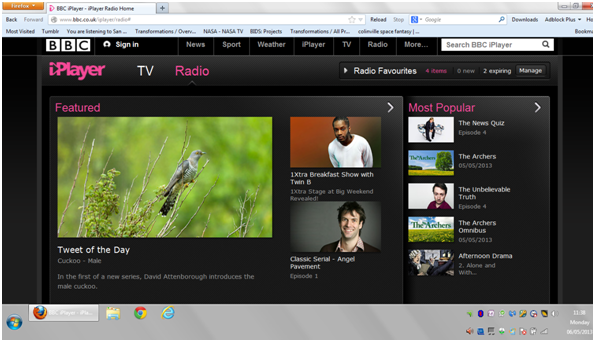
You can see immediately several radio programmes to listen to, in a variety of categories. If you see one you like you can click on it, and within a few seconds are listening to something. So for me, the Unbelievable Truth would do it if I hadn’t already heard it. so … click on that and done.
If you don’t see something, you can click on Favourites and see things you’ve previously tagged as things you’re interested in. It looks like this:

Ah OK — heard all of those so go deeper into the website, which you can do by scrolling down. In theory people don’t like doing this, but where is the evidence?
What’s great about this is that you can see the top selections from a variety of categories, which might lead you in a direction you hadn’t otherwise considered. Nothing there takes my fancy so I’ll head onto comedy and select that.

Well that should be enough choice. Round the Horne is pretty bona. However, if not then click on show all comedy and you have the entire list in alphabetical order.

So there you have it. Nice, straightforward and fast.
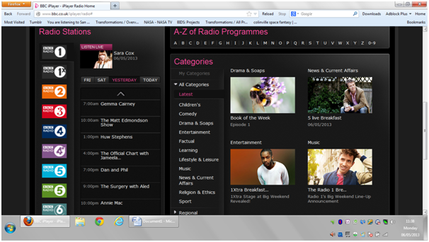
Here’s the landing page of the new interface:

You can immediately see the problem. Someone with a “design aesthetic” has been let loose. There is a lot of empty space which contains no information, and seems to be there just to look good. There are no links to actual programmes. We are forced to select a search strategy to find a programme two of which are meaningless. I mean who cares what station or what time of day it’s on?
So after a completely pointless and confusing click on “categories” we get to this :

And as you can see STILL NO LINKS TO PROGRAMMES. It’s another superfluous click on comedy to get to:
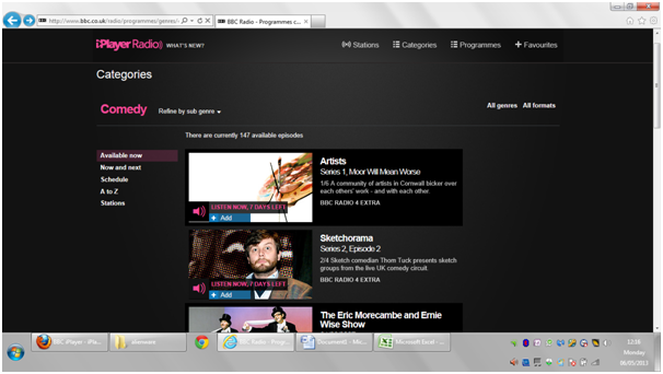
We can scroll down to see programmes but they’re not in any type of order. The only real advantage of the new interface is that it enables filtering by sub-genre. It needs one more click to get the alphabetical list:

Which also for some reason includes programmes which aren’t available. Is anyone actually thinking through this at all?
And yet with all the extra clicks, this is meant to be “simpler” … the assumptions seem to be that we are children who like big clear pictures with plenty of colour and not too much information at once. Reading is too hard for us. We know exactly what we want to search for (the opportunities for serendipitously discovering stuff are eliminated) and we have time to randomly click on things to discover content. None of these things are true and I resent the implication.
For the moment both are running side by side and this is fine. Maybe some people prefer the new version. But anyone who has let the designers loose on their interface ought to give people the option. For example the latest version of Firestorm (a virtual worlds viewer) has the option to switch between Firestorm (a gui-driven interface) and Phoenix (a text driven one). Not all of us rate aesthetics above speed of access to information and not everyone needs bright colours, or curved edges, or little animations in their interfaces. In fact, they’re distracting and annoying.
Why the rant? I suspect you’re wondering. It’s because I can see the online world becoming less and less usable as a result of designers being let loose on things, and either not consulting, or deliberately ignoring the user feedback, as if we’re too uneducated in “design” to know what we want. I had a huge argument with a colleague who said that a change had been made to something he’d been working on because people prefer GUI to text. “No they don’t” I replied. He just said that “yes they do”. My response: “Maybe most people prefer it, but by saying ‘people’ you’re implying that all do, and I know that’s not true because I don’t”. The result? He completely ignored the point I was making, possibly because I wasn’t a designer and so therefore wasn’t capable of making a proper judgment about what I liked. Unfortunately if no-one creating interfaces listens, the online world will become less usable. I no longer access videos on my xbox, because the user interface is messed up. I use Twitter much less because the interface is unwieldy. wordpress is another good example. WTF does that w in a circle mean really? Could they not put “menu” there or something? I was using WordPress for months before i realised I could access my Reader or Freshly Pressed by clicking on it. Bit by bit I can see the gradual disenfranchisement of the user as control over how the online world is accessed is ceded to “designers” and I’d quite like it to stop.

The XBox 360 ‘new and improved’ interface is overly complex and a definite case of style over substance. No…scrub that…there isn’t much in the way of style there either. A few weeks ago it took me 20+ minutes to find where a demo I’d downloaded from XBox Live was living. ‘Nuff said. Oh, and having a Start screen ‘layer’ that you have to piss about with before you can get to your traditional Desktop in Windows 8? WHY?! I spend my time ranting about keeping things simple and the value of the ‘3 click rule’…but for what?!
This video really sums up the frustration people feel when something is altered and made worse https://www.youtube.com/watch?feature=player_embedded&v=JvQcabZ1zrk Also I have to take back what I said about the combined Firestorm/Phoenix viewer. It’s far worse than the previous one. Chat history, the box to enter new chat, and IM notifications are split between three different locations on the screen, which not only makes following them more difficult, it takes up more space. Also there is an integrated spellcheck, which is OK, except that it’s really a bad spellcheck and doesn’t recognise international English spelling and there’s no way to switch it from US English to international English. I think US programmers need to realise that their spelling variants are still not how most people spell, and the mm/dd/yy format for dates is insane. Yes have that as an option by all means, but make it possible to easily change. I’ve deleted lots of apps because I can’t fix the date (I’ll refuse to accept that presenting any information with the smallest unit in the middle is not a screw-up), and the new version of outlook I have doesn’t allow you to fix it. At least if you’re going to only allow one, pick the international standard format
It seems to me like the new interface for the iPlayer has almost been engineered with the new half-tablet Windows 8 systems where there is a lot of touching the screen and simplified layout work so I can sort of understand why they have done it. On the other hand they have made it less useful for regular users who don’t have the latest system and enjoyed being suggested shows they might otherwise have missed. I reckon they’ve ended up making a conscious choice to trade their older system friendly and comfortable UI for something in keeping with the new tablet driven windows themes and in doing so have cut down on what they will have considered excess (the suggestions) since it does seem like it’s easy enough to find a program you already know you want to listen to.
I think the problem is that they’ve tried to use one interface for two different platforms, which not only have different functionalities, they have different user groups, and they’re now having to backtrack completely. The bottom line for me though is I just hate the way those tiles look, they’re just plain ugly. Really UIs should be much more easily user-configurable than they are now, there’s never going to be a one-size fits all that suits people because we’re all very different.
True but if you go down that route without enough planning or actual knowledge about what users will find most friendly you end up with the sort of box model in use by Windows 8 now where they have made it “configurable” to some degree by allowing you to move about the buttons and sort of resize them and whatnot. But that has evidently been unsuccesful in winning people over. What it seems people really need / want is something perfectly tailored to them as an individual but how many would actually take the time to tailor their UI personally?? At the moment good producers just do the best they can by proof testing their UI so it displays how they consider appropriate on different devices (with iPlayer apparently being an exception :L)
Yeah, good points. I actually spend a good hour or so tailoring the interface of an OS when I get a new laptop, and get frustrated when there are things I can’t change, for example the sensitivity of the trackpad on this Acer. I think one thing we tend to do is project our own preferences onto the community as a whole, and you’re probably right that most people don’t want to do that. A quick drop down menu of some major options would be maybe a halfway point, like Firefox allowing you to use text or icons for its menus for example, would work, with more options for those who are more picky. 🙂
Wow see even I don’t do that, I tend to adapt to the preconfigured UI and just make tweaks here and there when I get frustrated by things over time. :L But I think you’re right about there needing to be some sort of moderate configurability with an advanced section for those who will take the time but I’d go further than menus and give users the ability to choose a layout much like they might choose an interface theme whereby you have multiple preconfigured templates offering a range of choices so someone can choose a template that is closer to ideal for them. We can actually see that people would want this sort of thing as tablet app stores are full of apps that take over the default interface, I’m currently using one on my Nook called Smart Launcher and it’s reconfigured it to some degree to have a side menu bar that contains four main sections and those sections when selected show the appropriate apps.
Oh yep that’s a much better idea. I think there’d be a big market for that. Some providers don’t like people messing around with their stuff and don’t release necessary code, or even ban people (FB Purity for example), but really if it gets people using their stuff they should encourage it. I’d pay for stuff like that.